Canpol Babies Identification

The new identification of the Canpol Babies brand was created by the HiBrands agency under the supervision of Paweł Frej.
In the redesign of the Canpol babies logo, it was evident from the start that the "blue planet" or "sphere" and the rounded-sm grotesque typography were key elements that had become deeply embedded in the brand's identity. These aspects needed to be accentuated in a way that would update the logo to suit contemporary times, while also serving as a natural visual evolution, consistent with the refreshed brand strategy.


Other Case Studies
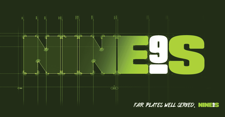
Nine's restaurant Identification
Visual communications for NINE'S, one of Poland's premier gastronomy concepts and co-owned by Robert Lewandowski.
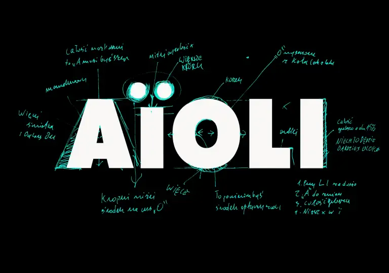
Aioli Logo Refinement
AIOLI's rebranding by cukier.works blended metropolitan and Mediterranean styles in its logo redesign and communication.